Flexbox for Mobile Web Layout
I was reading about Flexbox earlier from this article on CSS-Tricks and I found it extremely useful for a typical mobile web layout that you can see in below. The key feature from Flexbox that I found particularly useful is the ability to create containers that can fill the remaining space, which until recently, was achieved using JavaScript measuring and resizing on many mobile web framesworks (such as Dojo). The drawback with this JavaScript solution is that not only is it slow and irresponsive, but also unable to detect size change of surrounding elements, making software far more complex. So I looked up the availability of Flexbox on caniuse.com and pleasantly found it to be quite ready (at least in my personal opinion). I managed to implement a Flexbox based layout for a mobile web app I was working on and tested it on my arsenal of test devices. In this article I’d like to share my results and discuss the differences between each mobile browser. You may be aware that there are alternative mobile web layouts that are much more popular. I will discuss these near the end of this article.
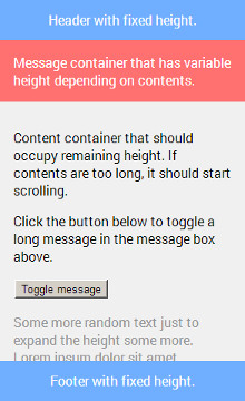
The number one reason why I am so fond of Flexbox when it comes to moble web layout is because it can be used to make content container expand to fill remaining space, which has always been a challenge with CSS previously. (If contents are too long, content container should be scrollable, which I will cover in another article.) display: block; does not expand height, and display: table; requires many more wrappers and has difficulty creating a row that fit variable content size (see message container from above layout). I’ve been solutions involving JavaScript measurements on resize event, which, needless to say, has its own set of problems. This is where Flexbox comes in for rescue. First of all, I’d like to clarify that this whole article revolves around creating a layout similar to the one shown above, which covers vast majority of mobile web layouts. I’m not trying to create generic Flexbox mixins. (In case you ask, no, Compass’ Flexbox mixins don’t work so well on mobile devices. I’ve tested them.)
Before we begin, please read this article on CSS-Tricks, which covers the concepts of Flexbox. This article assume you fundamental understanding of Flexbox. Now let’s get started! The main concept for the above layout is to have a main container that has:
.main {
    height: 100%;
    display: flex;
    flex-direction: column;
}
We use flex-direction: column; to establish top to bottom rows. Every child element inside, except content, don’t actually need any CSS properties at all! This is one of the beauties of this layout. Their heights will behave exactly what you expect, either fit content size or fixed size depending on what you set for height. Then we have content container, which we want it to expand remaining space. In order to achieve that, we need to set:
.content {
    flex: 1 1 0;
    /* Should be equivalent to: */
    /* flex-grow: 1; */
    /* flex-shrink: 1; */
    /* flex-basis: 0; */
}
What this means is that we want it to grow or shrink to fit remaining space with a base size of 0. Awesome, this should be the end of this article right? Not so fast! Let’s test this on various mobile devices. Before we begin testing, let’s see what caniuse.com says about Flexbox availabilities on mobile browsers.
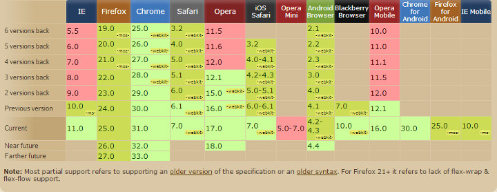
Cool! Looks like we got support from Android 2.1, iOS 3.2, BlackBerry 10, Windows Phone 8 and Windows 8 (IE 10). I’d call it pretty much ready for prime time. (eh, Microsoft.) One thing you may have noticed is that it says something about older syntax. What this means is that when Flexbox was being drafted, it actually had a very different syntax, and some browsers implemented this syntax. We will come back to this later.
iOS
iOS has a pretty standard support for Flexbox. All you have to add is the -webkit- prefix, which isn’t so bad. Other than that, I didn’t notice anything on my iOS devices.
Windows Phone 8, Windows 8 (IE 10)
This is where we start to run into some troubles. IE 10 supports a patchy syntax of Flexbox. What this means is that it supports the short hand properties flex: 1 1 0px; but not the individual property: flex-grow: 1;, flex-shrink: 1;, flex-basis: 0px;. At least we can get it to work with just the short hand. You may have notice that I put px unit to basis even though its value is 0. This is another issue I happened to have stumbled upon. Appearently on IE10, flex will not take effect unless you have a unit to basis, even if its 0.
BlackBerry 10
At first, BlackBerry 10 seems to be working fine, until contents got really long and you notice that its content container gets as long as its contents and pushed footer as well the bottom section of itself out of screen. Hm, how did this happen? We had flex-shrink: 1;, flex-basis: 0;. Shouldn’t it shrink? Well turns out it also supports a patchy syntax. The trick to fix this is to force its height: 0 instead and let it only grow.
Android
This is where old syntax kicks in. Android’s legacy WebView supports only old syntax, but Chrome as well as its new Chromium based WebView found on Android 4.4 KitKat supports the full blown new syntax. In order to get the old syntax to work, main container needs to have:
.main {
    height: 100%;
    display: -webkit-box;
    -webkit-box-orient: vertical;
}
Content container needs to have:
.content {
    -webkit-box-flex: 1;
}
Notice that content container no longer has flex-shrink: 1;, flex-basis: 0; properties. -webkit-box-flex: 1; covers both grow and shrink behaviours.
Putting Everything Together
Let’s write some LESS mixins to put everything together! (I’m pretty sure you can easily rewrite the followings as SASS mixins.)
.flex_display {
  display: -webkit-box;
  display: -ms-flexbox;
  display: -webkit-flex;
  display: flex;

  // When Twitter Bootstrap's hidden is applied to the same element, make sure
  // display is set to none.
  &.hidden {
    display: none;
  }
}

.flex_direction_column {
  -webkit-box-orient: vertical;
  -webkit-flex-direction: column;
  -ms-flex-direction: column;
  flex-direction: column;
}

.flex (@grow: 0, @shrink: 1, @basis: auto) {
  -webkit-box-flex: @grow;
  -webkit-flex: @grow @shrink @basis;
  -ms-flex: @grow @shrink @basis;
  flex: @grow @shrink @basis;

  // BB10 tweak.
  height: @basis;
}

.flex_main {
    .flex_display;
    .flex_direction_column;
    height: 100%;
}

.content {
    // TODO: Add your own styles.

    .flex(1, 1, 0px);
}
All you have to do now is to apply .flex_main to your main container and expand the mixin .flex(1, 1, 0); in your content container’s styles. You can see them all in action in this demo.
Popular Alternatives
If you’ve been a mobile web developer for a long time, you are probably aware of some of the more popular layouts. Currently the most commonly used one is to apply position: fixed; for header or footer, and have contents scroll with page body. Then add margin or padding that’s equal to the constant height of header or footer. This is a perfectly fine approach and is more backward compatible. (As far as position: fixed; goes, which was missing from mobile web browsers in the earlier years.) I have no objection to this approach as long as your requirements are fine with it. However while we are here, let’s compare the differences.
Pros:
- More platform backward compatible. No dependencies on scrollable container. (Again, I will discuss this in another article.) No dependencies on Flexbox, but Flexbox support goes a little further than
position: fixedsupport, so that’s not really comparable as a pro. - Somewhat more efficient, as Flexbox has much more sophisticated size calculations.
Cons:
- Items above and below contents must have constant size, otherwise it gets really funky (could involve JavaScript).
- Only one area is scrollable. If you are going to create a two-pane layout for tablet or slide-in menu for phone, you will have to create the secondary scrollable area with
position: fixed;and make it scrollable with either JavaScript based scroll or native scroll usingoverflow: scroll;combined with-webkit-overflow-scrolling: touch;(which is also used with the Flexbox approach). - If you are building a single-page application, page transition could get really funky (speaking from my experience with hacking around jQuery Mobile), and you may have limited options.
Another approach to mobile web layout dates even further back. You’d simply have footer and header at beginning and end of body. This approach obviously is the most primitive and have the most backward compatibility (because position: fixed; was missing for long time). The obvious drawback is that header, footer and message will be scrolled out of view, which makes it difficult to provide quick-access menu items.
In my personal opinion, Flexbox support is ready on mobile browsers (as we have discussed earlier), and native scrollable container is coming along nicely (not nicely enough for now, but the future is bright). Therefore I’d say the Flexbox based layout I have discussed in this article gives you the best control and options. It could be considered especially looking forward.